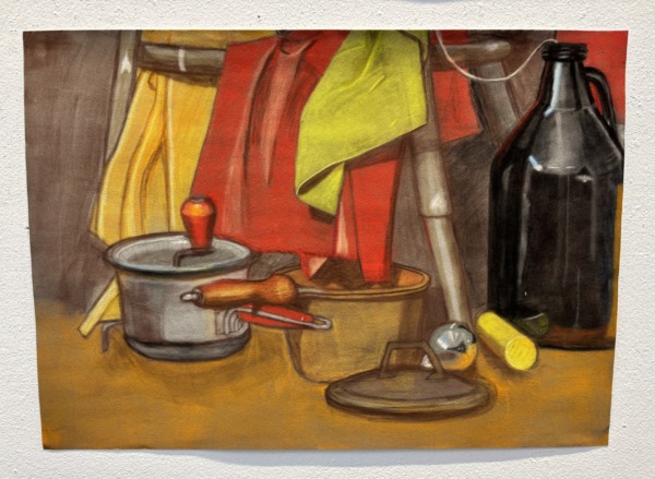
This is a still life that I created in my freshman year drawing class. The primary medium is soft pastels. I have really never created anything else like this in my life. Achieving something like reflections in a jug or the shimmer of something metal with just pastels was a lot of fun. A primary lesson that my drawing teacher taught us all in this project was undertones. You’ll notice the wooden handle of the brown saucepan has a red reflection on it from the cloth above, or that the red handle sticking out of the gray saucepan is highlighted with orange and yellow.
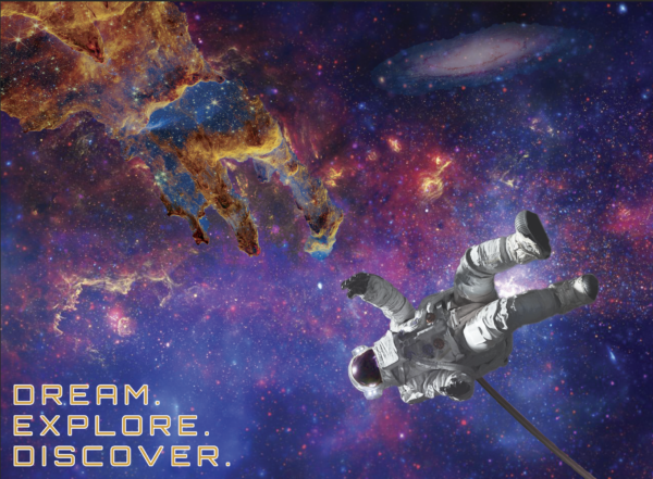
This is a billboard that I designed with Photoshop for my sophomore year Image class. The main assignment was to create a billboard that makes a statement. I myself am not much of an explorer type, as I would much rather stay indoors and listen to the rain than go hiking in the mud. Still, I was raised by my parents with a love for space. My bedroom is even Star Wars themed. When my family eventually gifted me a telescope, we made it a small hobby to take it outside to the driveway and stare up at the Moon, Jupiter, and even the International Space Station. The billboard is meant to evoke the image of The Creation of Adam by Michelangelo.
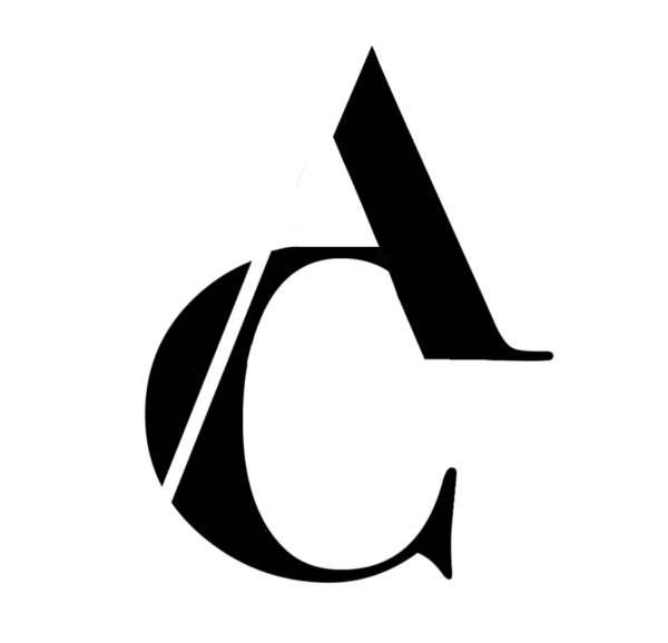
This is a lettermark that I created in my typography class. The goal was to create something recognizable using only two letters, preferably our initials. Me personally, when I look at this, I feel like I could easily see it on the side of an office building next to the highway or perhaps on the side of a catering company’s van. It surrounds itself with a strange formality that I can’t quite place as opposed to informality. I enjoyed using what I have learned in the past, like balancing positive and negative space, or even something more complex like the principles of Gestalt.